B2B Product | Internship
Designing the app version of Envision's energy management platform to enhance efficiency and flexibility for users
Project Type
Internship
Duration
4 months
Team
4 UI/UX Designer
My Role
UX Design Intern
PROJECT OVERVIEW
Problem
Envision's web version of the trading terminal presents limitations, including the inability to access trading information outside of work, the requirement to use a computer for basic tasks, and the lack of notifications for abnormal conditions. These shortcomings call for a user-friendly solution to address these challenges and improve the overall trading experience.
Solution Overview
✅ Increased the efficiency of extracting trading information and checking declaration results by 150%
✅ Improved flexibility and accessibility through the development of the mobile version
✅ Simplified the information structure to adapt to mobile devices, delivering user-friendly interfaces
Results
Our solution is to develop a mobile version of Envision's trading terminal, enabling users to access trading information, perform simple actions, and receive timely alarm notifications from any location.

PROCESS
BACKGROUND
Envision has launched Trading Terminal, an electricity trading platform for electricity generation enterprises.
Trading Terminal caters to the expansion of the market scale of electricity trading and solves pain points in the trading activities, such as scattered and opaque information, tedious transaction declaration process, low-level strategy and limited choice, and complex trading review process.
Trading Terminal can provide market information, recommend trading strategy, and analyze trading resumption, in order to make the power trading become more centralized, standardized, and intelligent.
RESEARCH
Use Cases: PC vs. Mobile
First, we summarized the difference between the PC version and the mobile version in several dimensions, which we should be aware of when we design the mobile App.
Pain Points Analysis
After we did the user interviews, we summarized some common user pain points of the PC version.
After we did the user interviews, we summarized some common user pain points of the PC version.
IDEATE
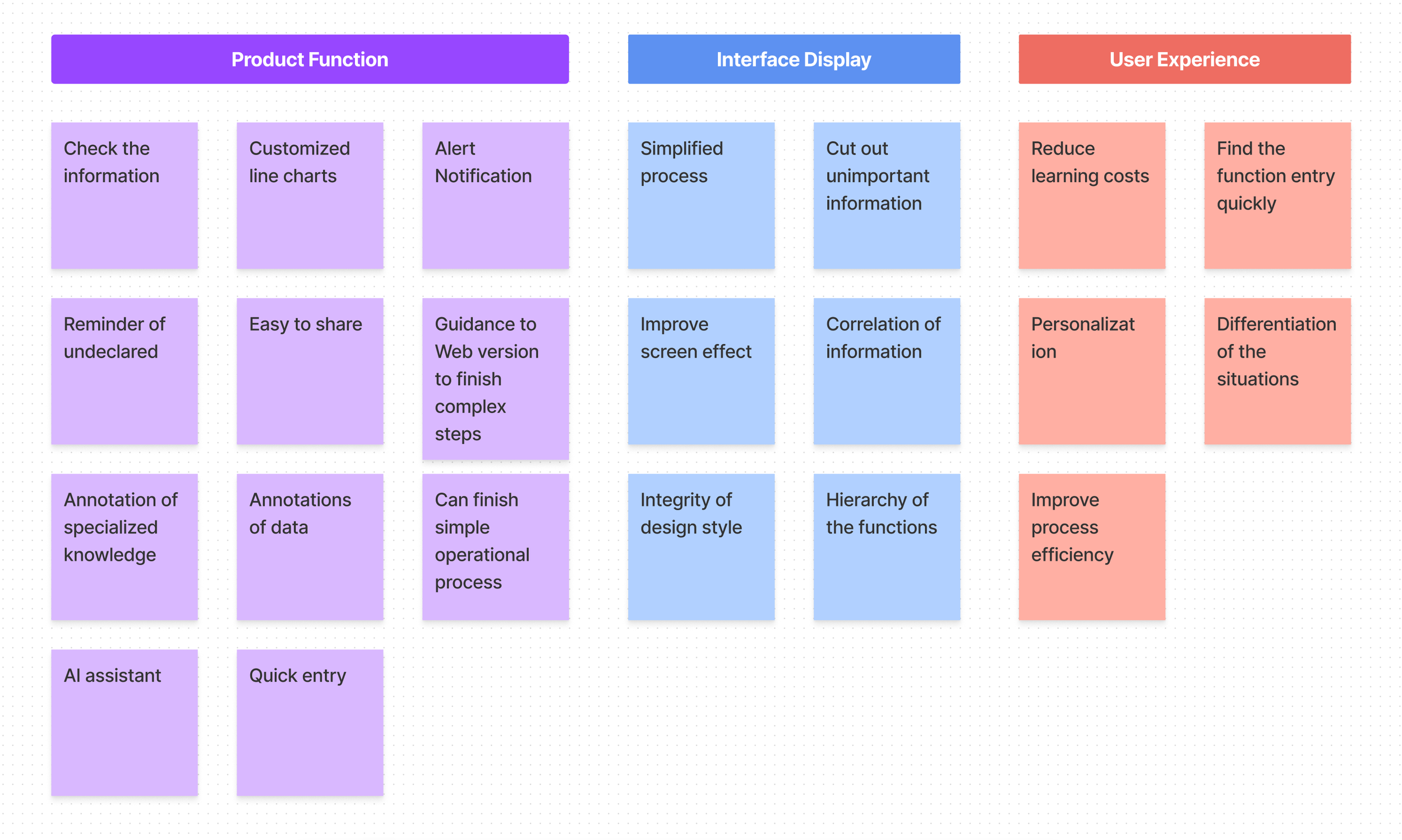
Brainstorming
Key Features
Information Architecture
The information architecture is originally designed in Chinese, so if you are interested in some details please reach out to me at qz266@cornell.edu, so I can further explain it to you!
Use Cases & User Flow

DESIGN
Sketches & Design Explorations

Design Strategies
By reading the book Simple and Usable: Web, Mobile, and Interaction Design, I’ve learned four useful design strategies: Remove, Organize, Hide, and Displace to solve the problem of complexity. And I also applied those design strategies in the prototype design.
Applications:
Remove
• Remove unnecessary functions that are not suitable for mobile, and only keep the functions that can be easily done while using mobile
Organize
• Rearrange the information architecture, and separate different functions in different modules and pages
Hide
• Hide the statistics of the line charts and only show the statistics when you click the charts.
• Hide some unimportant data and only display all the data when the user clicks the “all data“ button.
Displace
• Ask the users to go to the Web version to declare the trading information and finish other complicated actions, and displace the complexity from mobile App to Web.

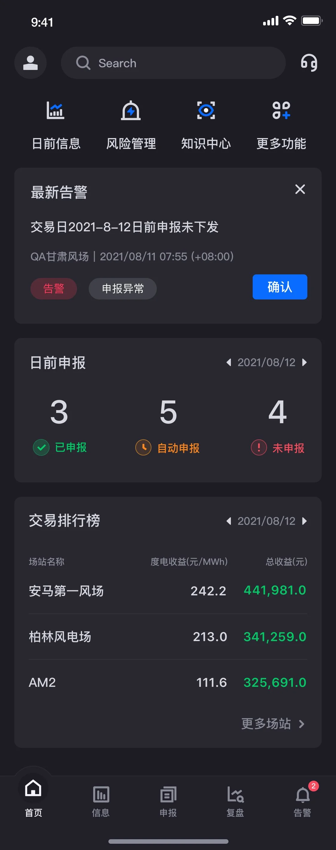
Hi-fidelity Prototype


