

Project Overview
Course Helper is a mobile app that provides students with convenient, time-saving, and smooth course selection experiences. By using Course Helper, students can post and see course reviews, get notifications when the courses have available seats, and easily create class schedules.

Solution Overview

Design Thinking Process

Empathize
Discovery
I’ve always been anxious when I have to choose courses for the next quarter.
First, I would read the course descriptions on the school website, but usually there was only the most basic course information. So I would turn to my friends and asked if they took these courses before, or if they had any recommended courses.
However, sometimes I can’t get enough information and reviews or I can't find anyone who has taken these courses before.
It's not just me in this situation. I have noticed this is a common problem encountered by college students. I have seen many students’ posts requesting course reviews on social media and forums. And some students were asking if anyone can create social media groups where students can post course-related reviews and feedback.

Therefore, my initial idea is to design a website where students can share and find course reviews, so the students no longer have to spend time searching for course information everywhere or asking their friends for the reviews. They can simply go to the website and find detailed course reviews.
User Research
Part 1 : Qualitative Research
So which aspects of course reviews do students want to see? What difficulties do they encounter in the course selection process? In order to get insight into the users’ needs, goals, and pain points during the course selection process, I conducted user interviews.

Key Findings
Most of the students said it is hard and time-consuming to find course reviews. Some of the students don’t know how and where to find them.
Freshmen and sophomores care more about the course content and the professors, probably because they want to explore different subjects and decide their majors. Junior and Senior are more concerned about the grades and the difficulty of the course, possibly because they want to keep a good GPA.
I have found two other potential problems during the interviews:
1. Students can’t get notified when the courses have available seats so they failed to get enrolled.
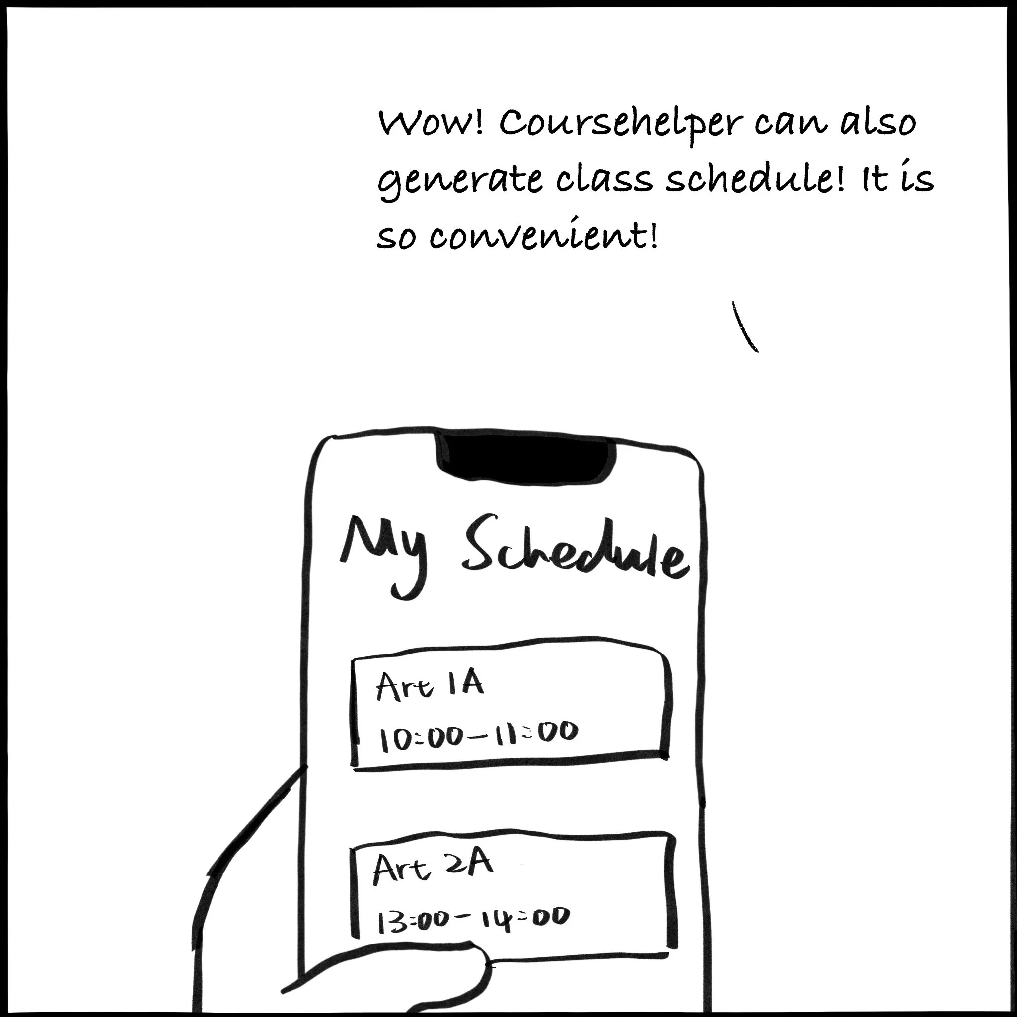
2. Students found it inconvenient to create class schedules manually.
Part 2 : Quantitative Research
In order to verify if the problems and needs I found in the user interviews commonly existed in larger college student population, I conducted the surveys and collected 36 effective responses.

Key Findings
80.6% of the 36 students thought it is not easy to find course reviews either offline or online.
Tho most popular aspects of the course reviews students want to get are: Course Content, Grades, Professor, Course Difficulty, and Course Workload.
91.7% of the 36 students once failed to enroll in a class due to the lack of notification for available seats.
While using the class schedule, students have experienced some common problems such as “Can’t Export Automatically” or “Inconvenient to Modify”.
Persona
Through user research, I have analyzed the users’ characteristics, needs, and pain points, and constructed a User Persona. User Persona helps me to define the target users, determine my design goals and ideate the key features of the product.

Competitive Analysis
I conducted the competitive analysis of similar products to see if they have some important features and if they could fulfill the user's needs.
During the user interviews, I found three products that students usually use to find course reviews and two products that allow students to create class schedules. And I didn’t find any products that enable the notification for available seats of classes.

Define
Concept Map
I use the diagram of an iceberg to illustrate my problem-finding process.
Initially, I only noticed one problem that students have difficulty finding course information and reviews in the course selection process.. However, after I conducted the user research and competitive analysis, I found two more problems related to enrollment and scheduling.


Ideate
Brainstorming
Based on the three potential solutions, I did the brainstorming to ideate what content and features could be included in the product.

Storyboard


User Flow

User Journey Map
To get more insight into user behaviors, I created a User Journey Map to understand what actions users need to take and what kinds of thoughts and feelings they might have in different steps.

Prototype
Lo-fi Prototype

Initial Hi-fi Prototype


Test
Usability Testing
I invited 4 college students and 3 designers to use my prototype and give thoughts and feedback. College students may focus more on the content and function, while designers might pay more attention to the visual design and experience design.


Conclusion
Content: Focus on the core information
Too much information will distract users and make the interface looks complicated. So it’s better to highlight the important information and modules and reduce the unimportant ones. For example, some users complain about the unnecessary information on the class lists, and some are overwhelmed by too much rating information.
Function: Find what the users actually need and do in every step
While designing the interface, I didn’t pay too much attention to the situations and user behaviors. For example, I noticed that when the users want to find course details, most users first glanced at the ratings, and quickly scrolled down to read the reviews and feedback, which means they are more concerned about the descriptive information. Moreover, on the schedule page, every class is placed in order. But when the users check their schedules, they want to know the length of each class, and how much time between classes, so I’d better place those classes in a timeline.User Flow: Do not ignore detailed user flow
Detail matters! If users are confused by some small steps, they will feel disappointed. If users don’t know what to do next, we need to design some clues to guide the users. For example, some users don’t know how to delete classes on the notification list, and some users have questions about how to add classes in the notification list to my schedule, so I have to add some icons or buttons to help users to finish those tasks.Design: Pay attention to the design guidelines
Because this prototype is mainly for user testing, I didn’t pay too much attention to the design guidelines. However, I will focus more on design guidelines in my iterations.
Prototype Iteration
Iteration
Based on the various feedback from the users, I continually iterated my design from four aspects: Content, Function, User Flow, and Design.
01 Schedule

Content
Remove redundant information (e.g. course number, teacher’s name), and only display the most important information students want to know while checking their schedules (e.g.class time, duration, location, class type).
Function
By zooming in and out, students are able to change the scale of their schedules. And By clicking the “View” button, students can easily change between the “Timeline View” and “List View”.
By clicking the “Download” button, students are able to download their weekly schedule in jpg format and share it with others.User Flow
If students want to edit the courses, they can click courses and enter the “Detail Page”, where they can delete courses, add to notifications, change colors, and add alerts. By clicking the location, the page will jump to Google Map.Design
Use different background colors to differentiate the courses.
Follow the design trends in flat design, and remove the drop shadow.
Adjust the layout grid, typography, and margins according to the IOS Design Guideline.
02 Search

Content
Remove the unimportant information (e.g. how many students enrolled).
Add the “schedule” or “Notification” icon to show if the class is already added to your lists.Function
Quickly add or remove courses by clicking the “schedule” or “Notification” icon button on the section list page.User Flow
Smooth user flow: Search by Subject—Course List—Section List—Class Information PageDesign
Remove the seemingly clickable button-shaped Open/Full icons, and instead use the small squares with green/red colors to represent the Open/Full status.
03 Course Information & Reviews

Content
On the main course info page, only the Overall Rating and the rating distribution will show. And if the students care about the ratings in specific aspects, they can go to “All Ratings” page.
Adding annotations to the ratings clarifies different rating scales.Function
Students can “agree” or “disagree” with the reviews.
See ratings and reviews in different quarters.User Flow
Easily enroll, add to schedule or notification list. Students can click the “Enroll” button and directly jump to the class registration website.Design
Each module follows the same design structure.
04 Notifications

Content
Separate courses in different enrollment status.Function
The “Enroll” button will appear if the class have any available seat. And students can directly jump to the class registration website and get enrolled as soon as possible.User Flow
By clicking the “Edit” button, students can easily delete classes.
After successfully enrolled in, students can directly add the classes in the notification list to the schedule.Design
Maintain a uniform design style with other pages.
Visual Design System

Final Design
Reflection
Learnings

Self-evaluation

More thoughts...
