


0-1 UX Design | App Design
Providing students with convenient, time-saving, and smooth course registration experience
Project Type
0-1 UX Design
Duration
4 months
Team
Individual
My Role
UX Designer + UX Researcher
PROJECT OVERVIEW
Objective
The project aims to create an end-to-end course registration process, assisting students in efficient decision-making, enrollment, and schedule creation.
Problem
Students face challenges during course selection due to limited access to course feedback, difficulties in finding available seats, and the time-consuming process of creating schedules.
Course Helper, an app that streamlines the course registration process for students by providing comprehensive course reviews, seat availability notifications, and an efficient class schedule creation feature.

Solution Overview
My Contribution
01. UX Design: Designed end-to-end course registration process, creating low-fidelity to high-fidelity prototypes and incorporating user feedback to iteratively improve the user experience
02. UX Research: Conducted surveys and interviews to gain insights into students' needs and pain points during class registration, and defined the project scope and clear design objectives
Design Impact
✅ 01. Increased efficiency by 86% in finding helpful course reviews
✅ 02. Reduced 60% time spent on checking course opening status to get enrolled
✅ 03. Improved efficiency in creating a course schedule by 75%
PROCESS

RESEARCH
Discover
Initial problem discovery based on personal experience and student requests
Many college students, including myself, face anxiety and challenges when choosing courses for the next quarter.
The school website often only provides limited and basic course information, leading students to seek advice from friends for recommendations. However, this approach may not always yield sufficient reviews or feedback for certain courses.

This common issue has been observed through numerous student posts on social media and forums, where they request course reviews and express the need for platforms to share course-related feedback.
Part 1 : Interviews
Which aspects of course reviews do students want to see? What difficulties do they encounter in the course selection process? In order to get insight into the users’ needs, goals, and pain points during the course selection process, I conducted user interviews with 5 college students.

Part 2 : Surveys
In order to verify if the problems and needs I found in the user interviews commonly existed in larger college student population, I conducted the surveys and collected 36 effective responses.

Key Insights
01. 80.6% of the 36 students thought it is not easy to find course reviews either offline or online.
02. The most popular aspects of the course review students want to get are Course Content, Grades, Professor, Course Difficulty, and Course Workload.
03. 91.7% of the 36 students once failed to enroll in a class due to the lack of notification for available seats.
04. While using the class schedule, students have experienced some common problems such as “Can’t Export Automatically” or “Inconvenient to Modify”.
User Research
Gain insights into users’ opinions and needs
Synthesis
Summarize research findings through persona and user journey mapping
Let's meet our primary user, Selina
A 20-year-old college student with a passion for academic excellence and a desire for a seamless course selection experience
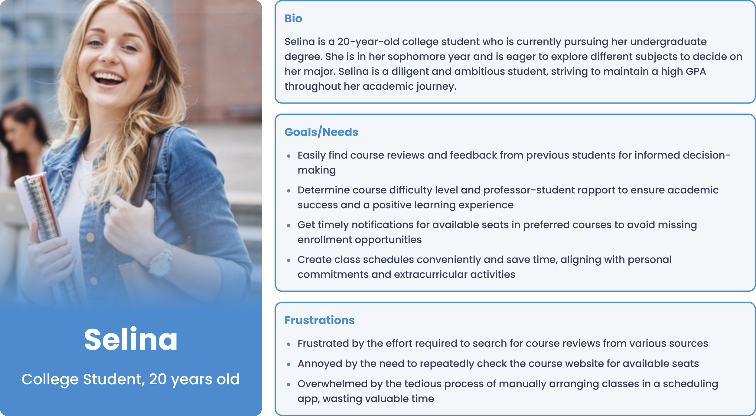
To get more insight into user behaviors, I created a User Journey Map to understand what actions users need to take and what kinds of thoughts and feelings they might have in different steps.

Competitive Analysis
I conducted a competitive analysis of similar products to see if they have some important features and if they could fulfill the user's needs.
During the user interviews, I found three products that students usually use to find course reviews and two products that allow students to create class schedules. And I didn’t find any products that enable the notification for available seats of classes.

Problem Finding Process
I use the diagram of an iceberg to illustrate my problem finding process.
Initially, I only noticed one problem that students have difficulty finding course information and reviews in the course selection process.. However, after I conducted the user research and competitive analysis, I found two more problems related to enrollment and scheduling.


DEFINE
Redefine the Problems & Goals

How might we streamline the class registration process, facilitating access to valuable course reviews, seamless class enrollment, and effortless generation of class schedules?
Based on the three potential solutions, I did the brainstorming to ideate what content and features could be included in the product.

IDEATE
Brainstorming
Storyboard

A: “What courses are you going to take next semester?”
B: “I want to take Art 1A but I don’t know if the course is worth taking”

A: “Don’t worry! You can add this class to the notification list and you’ll be notified when there’s any available seats.”

A: “Don’t worry, you can find course review and feedback on Course Helper!”
B: “Wow! Let me see!”

A: “Look! Course Helper sent you an notification! Art 1A has an available seat!”

A: “The professor seems good”
B: “Wow! Many students said it is an interesting class!”

A: “Hurry Up!”

B: “But the class is already full, and I’m not sure if I can still enroll in…”
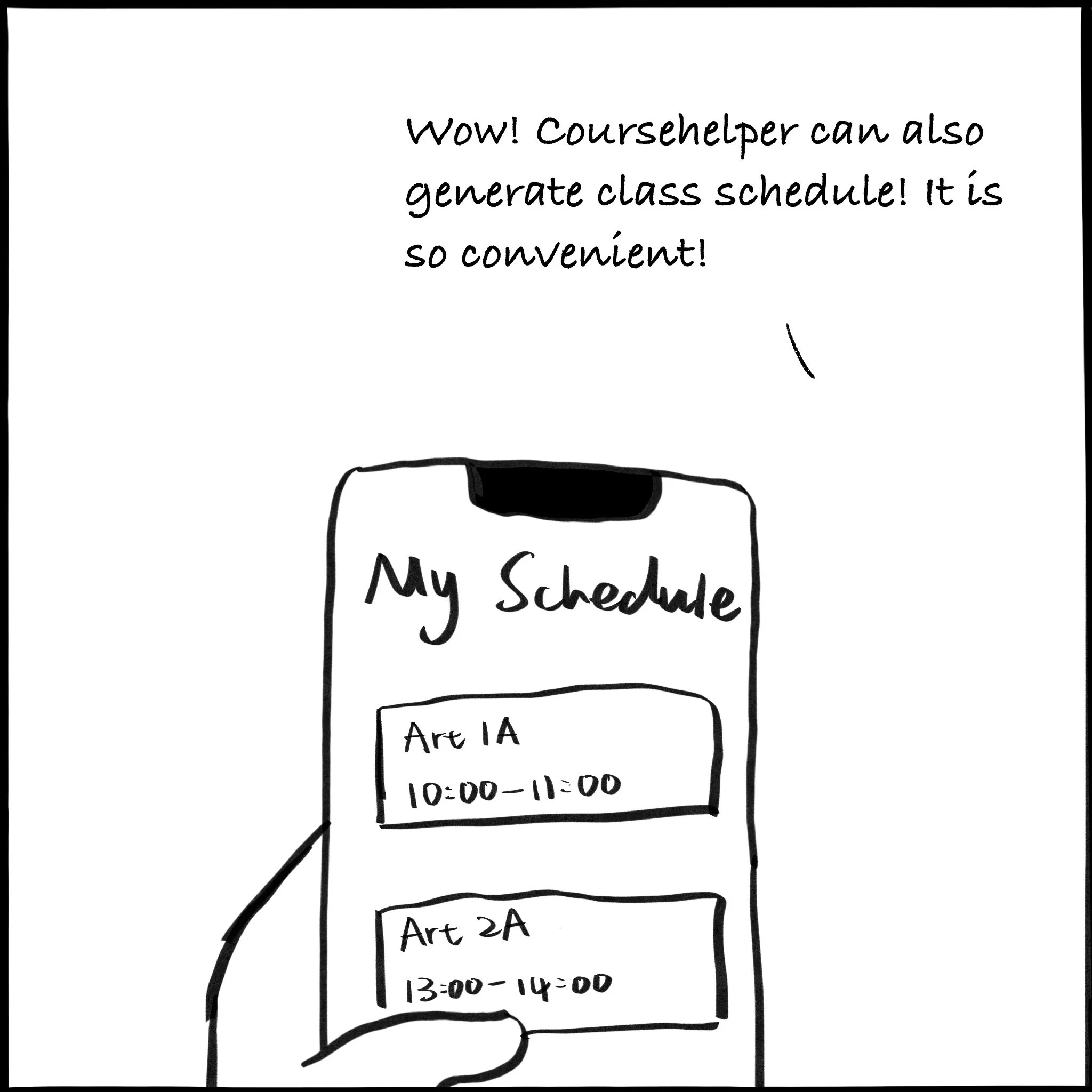
B: “Wow! Coursehelper can also generate class schedule! It is so convenient!”
User Flow
Before creating the prototype, I designed a user flow to map out how users will interact with the product, facilitating the organization of information and overall design structure.


DESIGN & TEST
Lo-fi Prototype
Visualize the information architecture with sketches
Mid-fi Prototype
Illustrate use cases through mid-fi wireframes

Evaluation & Usability Testing
Before creating the hi-fi prototype, I conducted usability testing with 4 college students, gathering their feedback on our design to make necessary improvements.

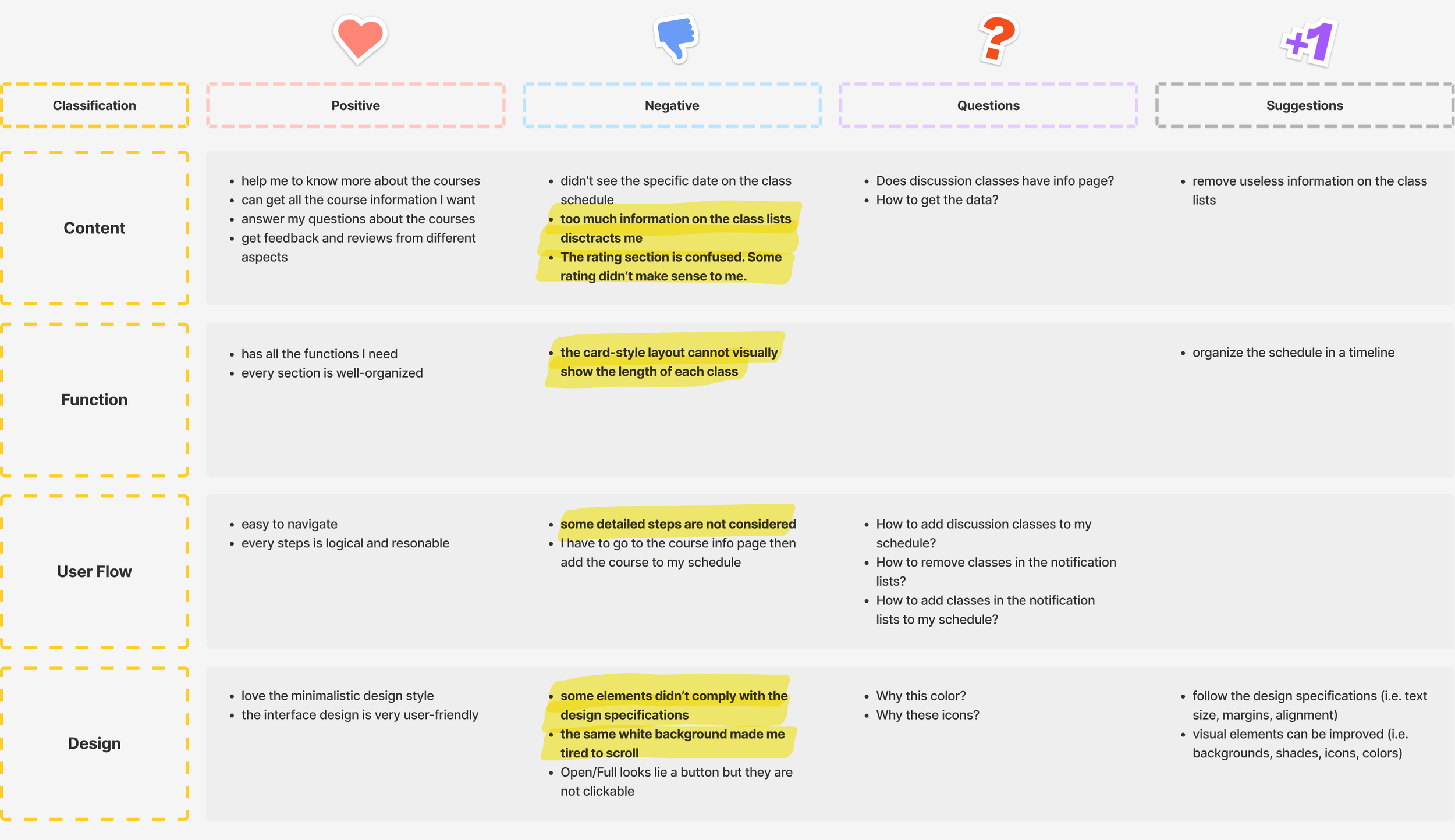
Key Insights
💡Content: Prioritize core information and modules, reducing unnecessary details to avoid overwhelming users and ensuring a clean interface.
💡Function: Understand user behaviors and needs at every step of the design process, accommodating their preferences and optimizing usability. For instance, displaying course details and schedules in a way that aligns with user expectations.
💡User Flow: Pay attention to the finer details of user flow, providing clear guidance and cues to avoid confusion and enhance user satisfaction. Implement intuitive icons or buttons to simplify tasks like deleting classes or adding them to the schedule.
💡Visual Design: Emphasize adherence to design guidelines, considering them more closely in future iterations to improve the overall aesthetics and user experience.
Iterations & Improvements
Based on the various feedback from the users, I continually iterated my design from four aspects: Content, Function, User Flow, and Design.
01. Search for Courses

Improvements:
Eliminated irrelevant information such as enrollment numbers and added icons indicating whether a class is already added to the user's schedule or notifications.
Simplified course management by introducing clickable icons for adding or removing courses directly from the section list page.
Streamlined user flow with a clear sequence of actions: Search by Subject → Course List → Section List → Class Information Page.
Replaced button-shaped Open/Full icons with small squares in green and red colors to represent the Open/Full status, eliminating the confusion of clickable buttons that are not intended to be interactive.
02. Course Information & Reviews

Improvements:
Simplified main course info page to display only Overall Rating and Rating Distribution, while providing an "All Ratings" page for specific aspect ratings. Added annotations to clarify different rating scales.
Enabled students to express agreement or disagreement with reviews. Allowed viewing of ratings and reviews from different quarters.
Streamlined enrollment process by adding an "Enroll" button that directly redirects students to the class registration website. Easy enrollment, addition to schedule or notification list.
Maintained consistent design structure across modules for improved visual coherence and user experience.
03. Schedule

Improvements:
Categorized courses based on enrollment status, distinguishing between available and full classes.
Introduced an "Enroll" button for classes with available seats, allowing students to quickly navigate to the class registration website and enroll promptly.
Streamlined user flow allowing students to easily delete classes by clicking the "Edit" button. After successful enrollment, provided the option to directly add classes from the notification list to the schedule.
Improvements:
Streamlined information displayed with only essential details like class time, duration, location, and class type.
Enhanced functionality with zooming capabilities, easy view switching between "Timeline View" and "List View," and the option to download schedules in jpg format.
Improved user flow allowing students to edit courses, add notifications, change colors, set alerts, and easily access location information with direct links to Google Maps.
Implemented visual design enhancements including distinct background colors for course differentiation, adoption of modern flat design trends, and adherence to the iOS Design Guideline for layout, typography, and margins.
04. Notifications

Design System

Impact
After iterating the design solution and finalizing the visual design, we conducted a second round of usability testing, which resulted in improved data concerning task completion efficiency and overall user satisfaction.

Increased efficiency by 86% in finding helpful course reviews

Reduced 60% time spent on checking course opening status to get enrolled

Improved efficiency in creating a course schedule by 75%


